Knock the Socks Off Your Data Reporting With These Cool Business Dashboards (6 minute read)
Knock the Socks Off Your Data Reporting With These Cool Business Dashboards (6 minute read)
In the current age of ‘big data’ and information overload, we are all continually challenged to keep information organised and in one place. In the “old days” (meaning about 3 years ago!) – only a handful of businesses would have access to advanced BI tools to help draw conclusions from their data. But now, with cloud-based tools so common, everyone in an organisation can have the latest metrics available at their fingertips.
The name of the game for keeping your data in order is dashboards – and in case you need a refresher, here’s a definition:
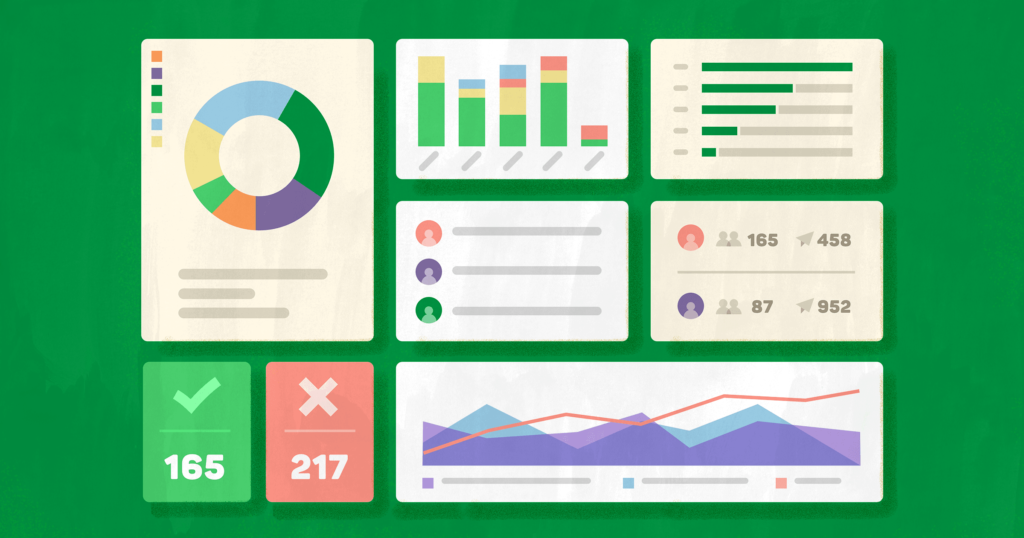
A business dashboard is an information management used to track key metrics, KPI’s and other key data points relevant to a business, department, or specific process. Using data visualisations, dashboards simplify complex data sets to provide users with ‘at-a-glance’ awareness of current performance.
The advantages of a solid data dashboard can’t be over-emphasised. Rather than manually producing excel sheets each time, you can keep all your key metrics in one nice, convenient location for everyone to access.
The main reasons why you’d want to have a data dashboard strategy in place for your business are:
Better transparency: Measure, interact, and analyse up-to-date information from one central hub.
Better decision-making: Access to real-time information enables everyone to make smarter, data-driven decisions.
Better ROI: Lose excel and gain productivity by giving everyone access to key metrics on the go.
The best way to illustrate the usefulness of data dashboards is by surveying some of today’s most popular dashboard solutions available. We’ve put together a quick review of the most popular solutions, with a few insights to help you find the best fit for your business.
Klipfolio
Klipfolio is a Canadian software company that has produced an outstanding product now trusted by over 11,000 businesses for their data reporting needs. This powerful tool connects to over 500 data sources, including common tools like Google Analytics and Google Ads, SEO platforms like Moz, Social Media platforms Facebook and Twitter, and on-premise data warehouses.Kipfolio does a nice job of providing beautiful and customisable dashboards that enable users to collect, measure, and analyse the information they need to make better business decisions.
The main advantage with Klipfolio is its powerful ability to develop completely customisable dashboards to match your specific company requirements.
It does require a degree of competence with data manipulation and coding to some extent which takes a bit of time to learn, but those familiar with data mining and reporting will be able to pick it up quite quickly.
Pricing ranges from a starter plan of $29 USD/month for 3 dashboards on up to the enterprise version of $99 USD/month for 20 dashboards and unlimited users.
Visit: www.klipfolio.com
Tableau
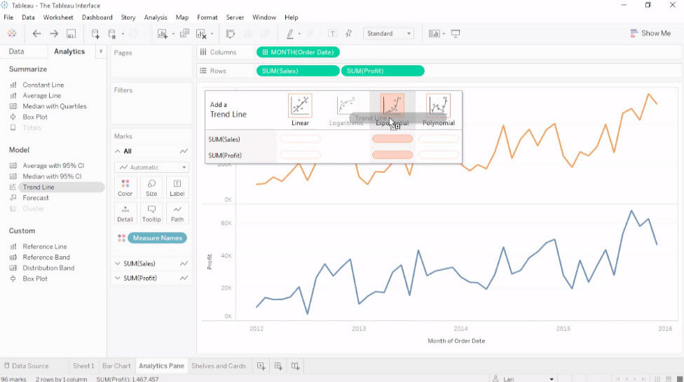
Welcome to the Mercedes Benz of data dashboards! With annual revenue of $848M, this Seattle firm holds the top spot in sophisticated business intelligence and data dashboard solutions. More than 86,000 businesses around the world use Tableau to get rapid insights and to make impactful business decisions.Research shows that data analysists spend 80% of their time preparing data for integration and 20% on the actual data analysis. Tableau has taken steps to reverse this with the introduction of Tableau Prep (codenamed “Project Maestro”). Tableau prep is a new data preparation tools that allows users to cleanse, aggregate, merge or otherwise prepare their data for analysis.
Tableau is leading the charge with innovating the data analytics space. The platform’s new “Ask Data” feature is touted as the next stage in the evolution of self-service analytics. It allows users to simply type a question such as, “What were my sales this month?” and then returns an interactive data visualisation that they can continue to explore, refine, or drill into for further detail – now that’s a pretty cool feature!
Pricing starts at $70 USD/per user/month. There are also options for teams and organisations based on the number of monthly users required.
Visit: www.tableau.com
Gecko Board
These guys are on mission “to make data useful” and do a great job of fulfilling this through dashboards that help users aggregate, visualise, and share the important data that drives business decisions.
Geckoboard lets you display several different dashboards on the same screen. You can add your own logo for a customised look and feel that matches your brand.
What’s more, the dashboard offers a cool ‘drag and drop’ features that allows users to simply add, remove, resize, and rearrange visualisations to reflect their team’s most current priorities. The company has done a fine job of ‘democratising’ data dashboarding in a way that makes it as easily accessible to newbies as experienced enterprise users. In our book, this is what makes Gecko Board totally worth a test run!
Pricing ranges from $49 USD/month for 2 dashboards up to $599 USD monthly for unlimited. Each package has a 30-day free trial to help you test the waters.
Visit: www.geckoboard.com
Dash This
This is another Canadian firm that’s pioneering an elegant reporting and dashboard solution specifically geared towards helping marketers create and share their performance reports with clients. Used by nearly 18,000 marketers and agencies around the world, Dash This allows users to consolidate their data and build interactive dashboards that deliver powerful metrics and KPIs.The software supports and meshes well with popular analytics and reporting platforms, including Google Analytics, Campaign Monitor, Bing Ads, ClickMeter, and Ginzametricx among others.
Dash This also comes with “preset widgets” which includes KPIs for every one of your possible data sources. These can quickly be added to your dashboard, which eliminates the headaches of trying to quickly find the KPIs you’re looking for at the last minute. Preset widgets definitely makes Dash This very much worthwhile!
Pricing offers 5 package deals ranging from the “individual” at $33 USD/month and 3 dashboards on up to the $499 USD/month enterprise version (100 dashboards.)
Visit: www.dashthis.com
Google Data Studio
Google’s data visualisation and reporting product moved out of beta testing in September 2018. Perhaps the best part about Data Studio is that it’s free and comes bundled with the familiar suite of tools that we’ve all grown accustomed to, making it easy and intuitive to pick up.
No one can really say it better than Google in describing their platform:
“Data Studio is part of Google Marketing Platform and closely integrated with Google Cloud, allows you to easily access data from Google Analytics, Google Ads, Display & Video 360, Search Ads 360, YouTube Analytics, Google Sheets, Google BigQuery and over 500 more data sources, both Google and non-Google, to visualise and interactively explore data.”
You can get started in minutes, with plenty of templates so you can start building good-looking dashboards and visualisations in no time.
They don’t cover all metrics for free however, but you can purchase connectors to other platforms through 3rd party service providers like Supermetrics or Improvado. You just need to set yourself up and with an account and purchase additional data sources through them.
Visit: www.datastudio.google.com
9 Spokes
We thought we had better feature a home-grown Kiwi product! 9 Spokes are based out of Auckland with the driving vision of helping small business get access to the same powerful BI tools historically only available to large companies.
They offer an intelligent business dashboard that centralises essential business data and presents that information in a way that is intuitive and easy to understand.
One powerful feature of 9 Spokes is a “recommendation feature” that gives you a list of all apps that boost your business data gathering and analysis. Gone are the days of wading through hundreds of apps that may or may not work with your existing business systems and workflows.
9 Spokes is free, no strings attached! Their primary revenue comes through referral and licensing fees from their app partners and enterprise customers.
Visit: www.9spokes.com
Cyfe
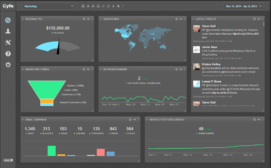
Since its founding in 2012, Cyfe has carved out a formidable niche as a robust online business dashboard that makes it easy to monitor everything – social media, web analytics, marketing, sales, support, infrastructure – from one convenient location.
Cyfe offers all kinds of business app integrations, along with pre-build widgets, to make data dashboarding easier and more intuitive for a wide range of user types.
Cyfe is especially popular among marketers and IT departments.
Collaboration on Cyfe is a breeze as the platform enables users to share their dashboards with management, clients, collaborators and other users via public URLs, scheduled reports, and Cyfe accounts.
Cyfe follows a freemium pricing model for access to its all-in-one data reporting features. A premium version goes for $29 USD/month for unlimited dashboards and widgets, historical data, exports, and other premium options.
Visit: www.cyfe.com
Sisense
Sisense was founded in Israel way back in 2004 – well ahead of the data revolution! But it hasn’t slowed down, and in fact was the first data analytics tool on the market to offer a single-stack solution, which makes it one of the fastest platforms out there. The company announced another $80M round of funding in September 2018.
Under the hood, Sisense offers users a ready blend of comprehensive dashboards that are intuitive and easy-to-use, well-connected platforms, reliable support, and mobile dashboards.
Sophistication and innovation are wrapped up together in the Sisense platform. For example, The In-Chip engine is not only super fast but lets you ask any question and get immediate answers without having to go back and start over each query from scratch. What more could you want?
Sisense pricing isn’t published but the company offers customised annual subscription plans upon request. They also offer a free trial to give users a taste of what the platform has to offer.
Visit: www.sisense.com
What next?
‘Big data’ often seems like a bottomless ocean that you may be afraid of facing – perhaps you’d rather stay on the shore where it’s safe … or so you think. The problem with this approach is that these days you can’t survive without managing your data quickly and efficiently.
SO, WHY NOT CONSIDER THE SURFING ANALOGY?
Waves never end, they’re in endless supply – you just need to head to the right beach, grab the right “board” and go for a ride! Likewise, there’s never been a better time to launch into data dashboarding than the present.
Tons of outstanding dashboard software exist today on the market. We’ve showcased some of the most popular dashboard platforms, some of their highlights, and pricing information.
SO, WHAT WILL YOU DO WITH THIS INFORMATION?
Might we suggest giving a few of them a go. Start navigating the ocean of big data today and catching those waves!


